
**This post serves as both a recap of February’s #ProjectHealthViz, which was on Sanitation, as well as a guide to four common Gestalt Principles. Thank you to all the participants this month!**
The Whole Is What, Exactly?
If you haven’t been living under a rock for the past century, then you’ve probably heard of the word Gestalt, the German word for form, shape, or figure. More likely, perhaps, is that you are familiar with the statement, “The whole is greater than the sum of its parts.” It’s worth noting that the common phrase is often translated inaccurately.
The translation is: The whole is other than the sum of its parts.
This is an important distinction because the whole isn’t more than the parts, it is different than the parts. The whole takes on its own form that only exists because of the parts.
Gestalt Theory & Perception
The theory of Gestalt has roots in philosophy and psychology dating back to the late 1800s. At its simplest, the whole form is perceived (or emerges to our visual pathways) rather than the individual parts. A major reason that humans perceive the world, and the objects within it, into organized, regular, and simple shapes, schemas, figures, or forms, is due to how we visually interpret the world.
Without going into too much about sensory perception, brain pathways, and the biology of our eye, let’s just get two important facts clear:
- Vision, and how we perceive or interpret, what we see, is mostly a result of our brain and nervous system pathways transmitting sensory stimuli. This is why people may have perfectly functioning eyes, but still cannot see if those pathways to the brain are wired incorrectly or are damaged, such as with individuals with Cortical Visual Impairment (see a viz on that here).
- While 70% of our experience of the world is taken in through the sense of vision, our brains can only process less than 5% of our visual world at a time.
This is all to say that our brain often sees things different than what is actually present. If you are aware of optical illusions or the famous “gorilla in a crowd” study, you know that we often don’t process everything in our visual field. The fact is that there is just too much for our brains to take in and if we did, we would be paralyzed by trying to interpret it all.
So what does our brain do? It simplifies.
Gestalt principles, as well as pre-attentive attributes (which I’m not reviewing here), are methods by which we organize the world so that it’s familiar, makes sense, and is easy to process.
So why is it important to understand these laws of perception when working in data visualization? Well, for one, they can help guide your decision making as you put together a graph or a dashboard. Additionally, they help your reader better organize and interpret charts and graphs and make sense of the information visually, with exceptional speed.
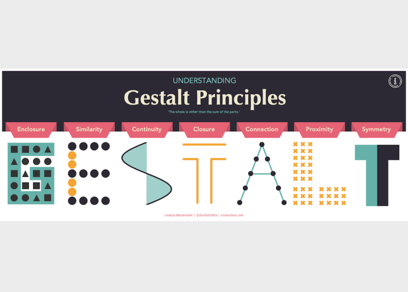
Check out the viz below in it’s interactive form which shows descriptions for all seven Prinicples.
There are seven main Gestalt principles that have clear applications in data visualization.
- Enclosure
- Similarity
- Continuity
- Closure
- Connection
- Proximity
- Symmetry
This post will review how the four most common Gestalt Principles in data visualization design (highlighted in bold above) can be used to enhance how people view and interpret your visual, and guide your analytical story. Examples will be provided for each of the following: Enclosure, Similarity, Proximity, and Symmetry.
Enclosure
The definition of enclosure is this: objects collected within a boundary-like structure are perceived as a group. By placing a line or shading around visual elements on a dashboard, signals that objects within the boundary form one, or belong together.
Meera Umasankar brilliantly uses this technique in many of her visualizations. Aside from the fact that the objects within the container become grouped together and interpreted together, they also stand out. This means that they command more of my attention. So if you want to ensure something on your visualization is viewed, enclose it. And if you want to show that certain elements go together, then enclosure is a fantastic visual way to enhance your dashboard.
In data viz, we can use this technique to visually group objects together by borders or a shaded background area. For example, a side-panel for key metrics, a collection of BANS, charts that tell a story when analyzed together.
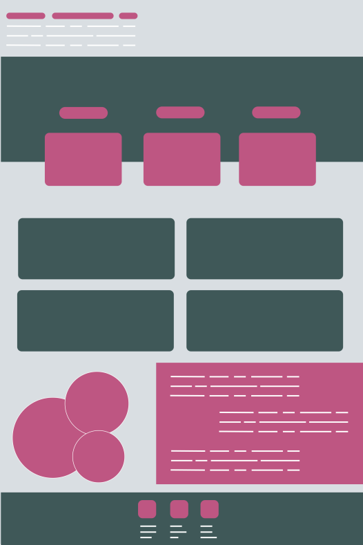
In this example template below that I created, we can see a few examples of how the rule of Enclosure, directs our eye and groups objects together. We likely are immediately drawn to the side panel with five shapes enclosed with a border. This effect is quite strong and it signals that those elements are a group. Additionally, background grouping is also effective as we can identify elements (green shapes) within the darker background. Again, this tells us they are a group.
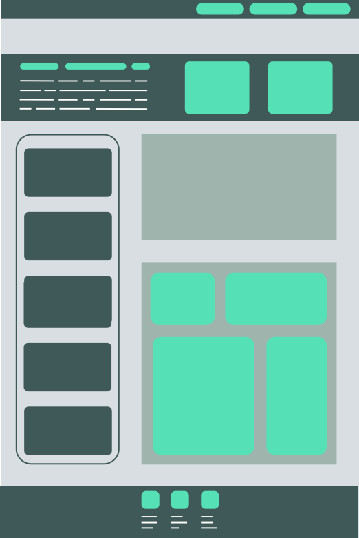
Enclosure is highly effective in helping your viewer know where to look and what to look at together. The technique can help keep a flow to your story and analysis, and direct your user to more likely view grouped elements at the same time vs. randomly looking all over the page to what catches their eye.
Similarity
When objects share similar attributes, such as color, direction, or shape, they are perceived as being part of a group. The Similarity Principle can help someone more readily identify which groups the displayed data belong with.
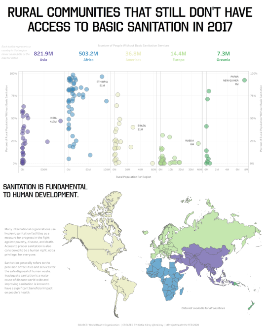
Katie Kilroy uses color to group objects together on her visualization. Color shows the viewer which dots go together. Visually, it’s unmistakable which dots belong in a group. The visual impact of color is actually stronger than that of enclosure, as you can see from the borders on the viz below. If all the dots were the same color, it would be slightly more difficult to know that each column is a group of countries within a similar continent/region. However, color is immediate as is extremely effective at grouping objects.
When we use Similarity, an object can be emphasised by being different from the rest; and can be used to create contrast or visual weight. Similar colors can draw the viewer’s attention to a specific piece of content within the dashboard while assisting with scanability, as the similar color elements will stand out.
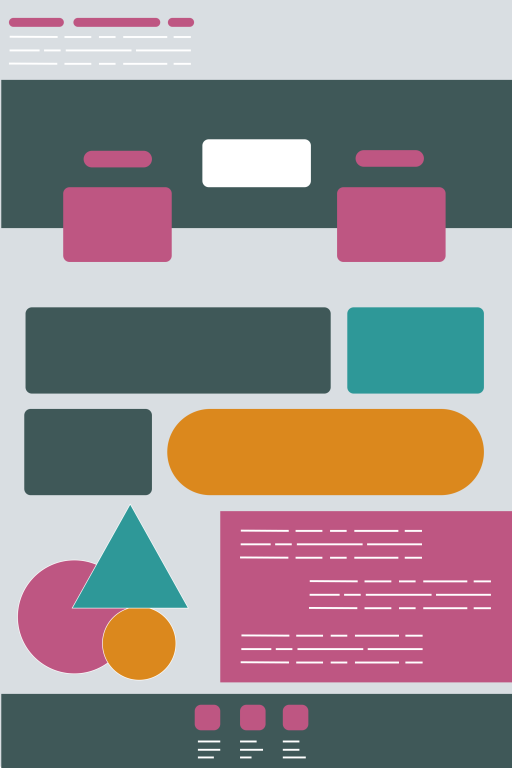
In the below example template, we can see similarity in a few ways. First, the identical pink shapes at the top in a row suggest that these are a group. The following four rectangles of the same color also follow the same Similarity Principle. Lastly, you can also use shapes of the same color, but of different sizes, as indicated in the circles at the bottom of the visual. The similar shape and color informs our brain that those objects belong together.
While all of this sounds rudimentary or, perhaps, obvious, that’s likely because you do much of this naturally as a data visualization designer. However, for some, designing with concepts about visual perception and cognitive processes in mind, don’t come naturally. Therefore, it’s important to teach people how effective these Principles can be and examples of how to use them when designing a dashboard.
To drive the point home, let’s look at an example of the above dashboard template but with a few things changed: color and shape and position. Notice how it’s much more difficult to know, with some level of certainty, which things go together. Since there is a lot of variety, we begin to question if objects of a similar color, shape, or position really go together. Nothing is very consistent.
Proximity
Moving on to Proximity. This is the Principle that most data visualizers know well. We are accustomed to placing charts and graphs near each other or in some organized arrangement. We put filters usually together and we place titles near (above) the graph that they describe. It’s common to align text near the object that it is describing. The Proximity Principle states that objects arranged close together are perceived as more related that those placed further apart.
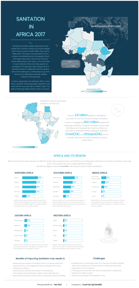
Tausif Kazi uses Proximity in two key ways. First, keeping text close to the relevant chart helps a user know that the text and the visual should be read and interpreted together. He does this in the middle section as well as in the lower charts, where text is directly below each chart instead of, for example, all in one paragraph above all the charts. By bringing the relevant text as close as possible to the corresponding chart, it becomes exceptionally clear that the text goes with the chart it’s next to. The second way he uses Proximity is through the small multiples chart near the bottom of the visual. Here, using both similarity and proximity, it’s clear that the five charts are a group. If these were spread out randomly around the visual, the grouping would be less obvious.
Symmetry
Last is the Symmetry Principle which states that symmetrical elements tend to be perceived as belonging together regardless if they are far apart. Symmetry gives us a sense of solidity and order. If we think about nature, many things have symmetry – our bodies, the shape of a leaf, a butterfly’s wings. Humans are attracted to symmetry mostly because it’s familiar, but also because we are programmed to recognize symmetrical objects such as faces.
In data visualization, symmetrical elements are pleasing and feel harmonious. This means people will naturally want to look at symmetrical visualizations more than asymmetrical ones. Symmetry is useful for communicating information quickly and effectively. On the flip side, when a viz has a lot of symmetry followed by something asymmetrical, can help with drawing attention as we are naturally going to notice that which doesn’t follow the Principle of Symmetry. Both symmetry and asymmetry are important in data visualization design.
In the example below, there is horizontal symmetry as well as vertical. This makes for a clean and simple visualization. While symmetry cannot always be achieved, and often isn’t necessary, it is good to understand how symmetry can create a beautiful and engaging visualization that people will naturally be drawn to.

As always, reach out if you have questions, but I hope these examples are helpful in understanding how to use these Principles when designing elegant and effective visualizations.
Lastly, feel free to check out my submission for February’s #ProjectHealthViz here (if you are interested in the Mekko chart I created you can see my post on that topic as well) and the other community submissions below.
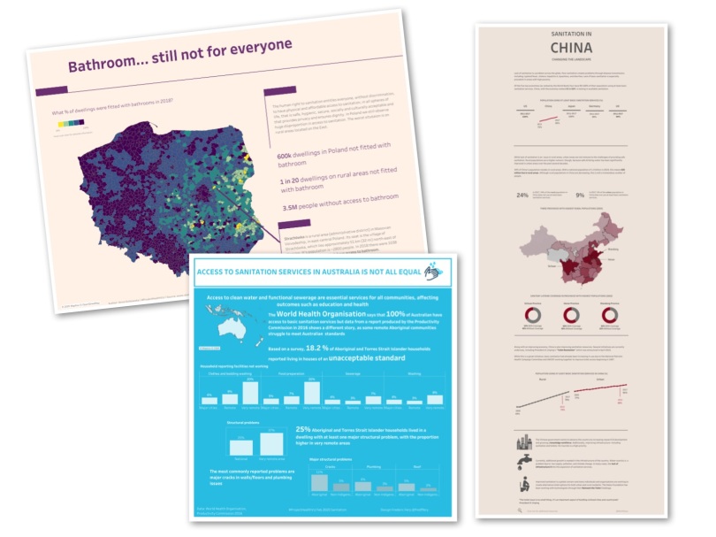
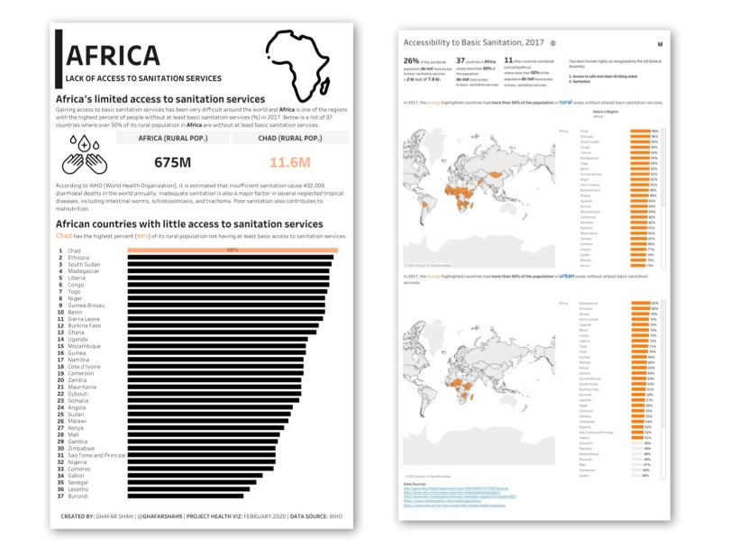
Community Submissions
Below are the other community submissions this month. Thanks for all of your hard work on these!


Thanks a lot Lindsay for the wonderful information you provide everytime. Is there any chance that we can download the workbook and explore how you did it.
LikeLike
HI Naveen, glad the information was helpful. The workbook won’t show you too much as it’s just x/y coordinates for each letter. The data I manually created in Excel to get the exact points I wanted for the visual. Each letter was a different data set. Does that help a bit?
LikeLike